Mark Rothko and the Weight of Color
Why the painter most famous for color insisted he was not a colorist, and what his canvases actually do
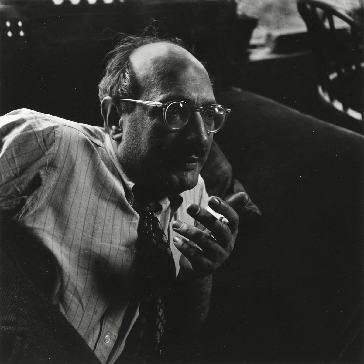
Stand in front of a mature Rothko and the first thing you register is color. A field of orange over a band of red, a maroon that seems to breathe, a black that turns out to be plum. It is the obvious thing to talk about. Rothko spent much of his career asking people not to.
He did not think of himself as an abstract painter, and he did not think of himself as a colorist. In a 1956 conversation with the critic Selden Rodman he said he cared about expressing basic human emotions, and named tragedy, ecstasy and doom. Viewers who were moved only by the color relationships, he added, had missed the point. Color was the means. The subject was something else.
That tension is the most interesting thing about him. Few painters have used color so completely, and few have been so suspicious of it.
From Dvinsk to the stacked rectangles
Mark Rothko was born Marcus Rothkowitz in 1903 in Dvinsk, in the Russian Empire (today Daugavpils, Latvia). His family emigrated to Portland, Oregon, in 1913. He studied at Yale for two years, left without a degree, and settled in New York, where he took classes at the Art Students League, including with Max Weber.
His early paintings are nothing like the work he is known for: subway platforms and city interiors in the 1930s, then, in the early 1940s, mythological and surrealist pictures full of biomorphic shapes. Slow Swirl at the Edge of the Sea (1944) belongs to that phase. In 1943 he and Adolph Gottlieb wrote a letter to The New York Times defending their work. Among its points: they favored the large shape for its unequivocal impact, and only subject matter that was tragic and timeless was valid.
Between 1946 and 1948 the figures dissolved into loose patches of color that later writers called the multiforms. By around 1949 the patches had settled into the format he would keep for the rest of his life: two or three soft-edged rectangles floating on a colored ground, stacked vertically, usually on a canvas taller than a person.
The format barely changed after that. The color did all the work.
Not harmony, drama
Most color advice is about harmony: which colors sit well together. Rothko was after something closer to theater. His titles are often just inventories, Orange and Yellow, Green and Maroon, Black on Maroon, but the pairings are chosen for tension, not comfort.
A few of his habits are worth naming.
- Close values, different hues. Many of the classic paintings put colors of nearly the same lightness next to each other: a red against an orange, a maroon against a brown. With little contrast in value, the edge stops reading as a line and starts to vibrate.
- The ground shows through. The rectangles never quite reach the edge of the canvas. A band of the ground color frames them, and the same color often seeps through their thinnest passages, so figure and ground share a single atmosphere.
- Soft edges. The rectangles are brushed out, feathered and scumbled at the borders. Without a crisp edge, the eye cannot fix where one color ends, and the forms seem to hover in front of the canvas or sink behind it.
- Light from inside. Rothko built color in many thin layers. Light passes through the upper washes and reflects off the ones beneath, which is why the paintings seem lit from within rather than from the room.
None of this is a theory in the sense Kandinsky or Itten offered. Rothko never wrote a color system. What he left instead was a set of conditions under which color would do what he wanted.
Thin paint, many layers
The glow comes from the way he handled paint. Rothko thinned his oils heavily with turpentine and applied them in washes, sometimes staining the canvas almost like watercolor, then built up dozens of veils. Conservators who have studied his work have found that he mixed his own media, adding ingredients such as egg, damar resin and, later, synthetic resins to the oil. Some layers were matte, some glossy, so the surface changes as you move.
The result is a color that cannot be reduced to a single value. A field that reads as red from across the room turns out, up close, to be a red veil over an orange one over a pinkish ground. Any single sample of a Rothko is an average of several colors sitting on top of each other.
That is also why his paintings photograph badly. A reproduction flattens the layers into one surface, and the glow, which depends on light travelling through paint, disappears.
Scale and distance
Rothko painted large on purpose, and not for grandeur. At a 1951 symposium he explained that painting a small picture puts you outside your experience, looking at it from a distance. With a large one, he said, you are in it.
He wanted the viewer in it too. He is often reported to have recommended standing about eighteen inches from the canvas. At that distance a seven-foot painting fills most of your field of vision. There are no edges to anchor you, only color on every side. The relationships between the rectangles stop being a composition you look at and become a space you stand inside.
This is a different idea of color from the swatch. A swatch is something you hold at arm's length. Rothko's color is meant to surround.
Low light and the darkening
As the 1950s went on, the palette darkened. The bright oranges and yellows of the early classic paintings gave way to maroons, deep reds, browns and blacks.
The turning point was the Seagram commission of 1958: a series of murals for the Four Seasons restaurant in the new Seagram Building in New York. Rothko painted dark reds and maroons, with open rectangular forms like doorways or windows. He later withdrew from the commission and returned the money. Nine of the paintings went to the Tate in London; they arrived on 25 February 1970, the day he died. Others are now at the Kawamura Memorial DIC Museum of Art in Japan and the National Gallery of Art in Washington.
Rothko was also exacting about how his paintings were shown. He asked for low light, small rooms and canvases hung close to the floor, sometimes sending detailed instructions to galleries. Bright gallery lighting, in his view, flattened the paintings and drove away the sense of light coming from within. The dark paintings in particular need dim light: under strong illumination a maroon reads as a flat surface, while in half-light it seems to open.
When the color fails
The Harvard Murals show what happens when this approach meets time. Rothko painted the panels between 1961 and 1962 for a penthouse dining room at Harvard's Holyoke Center, with crimson grounds and dark forms. He used Lithol Red, an inexpensive synthetic pigment, mixed in places with ultramarine.
Lithol Red is not lightfast. The room had large windows, and the blinds were often left open. Within a few years the crimsons had faded toward pale blues and pinks, and in 1979 the murals were taken down and put into storage.
In 2014 the Harvard Art Museums found a way to show them again without retouching them. Conservators and engineers worked out, panel by panel, the light needed to restore the lost color, and projected it onto the canvases. Switch the projectors off and the faded paintings appear; switch them on and the reds come back. It is a striking demonstration of Rothko's own conviction that his color lived in the meeting of paint and light.
The chapel
The last major project took the darkness as far as it would go. In 1964 John and Dominique de Menil commissioned Rothko to paint a series for a chapel in Houston. He made fourteen canvases: a triptych and single panels in deep plum and black, some with black rectangles on maroon grounds, some almost entirely dark. The room is octagonal and lit from above.
Rothko never saw it finished. He died by suicide in his studio in February 1970, a year before the chapel opened in 1971. In his last two years he had also painted the Black on Gray series, in acrylic: a dark band above a gray one, the most reduced pairing of his career.
The chapel paintings ask more of the viewer than anything else he made. In daylight they shift from black to purple to brown as clouds pass. At first they seem to be nothing. Given time, they become very much something.
Looking at color the way he did
Rothko's paintings do not offer rules, but they do offer a way of looking that applies to any color.
- Value before hue. Two colors of similar lightness behave as a single field; strong contrast in value makes a shape. Most of Rothko's effects come from keeping values close.
- Edges change everything. The same two colors read as a flag with a hard edge and as an atmosphere with a soft one.
- Light is part of the color. A dark red under bright light and the same red in half-light are two different experiences. Judge colors in the conditions they will actually be seen in.
- Size changes meaning. A color that is pleasant in a small square can be overwhelming when it fills a wall. Choose colors at the scale they will be used.
- Color is a means. Rothko's advice, in effect, was to decide what a work needs to say before deciding what color it should be.
That last point is the one he would have insisted on. The rectangles were never the subject. They were the place where something else could happen.
Sources
- Mark Rothko and Adolph Gottlieb, letter to Edward Alden Jewell, The New York Times, 13 June 1943.
- Mark Rothko, statement at the symposium "How to Combine Architecture, Painting and Sculpture," Museum of Modern Art, 1951, published in Interiors, May 1951.
- Selden Rodman, Conversations with Artists (1957), which records his 1956 conversation with Rothko.
- Mark Rothko, Writings on Art, edited by Miguel López-Remiro (Yale University Press, 2006), which collects the letter, statements and lectures above.
- Mark Rothko, The Artist's Reality: Philosophies of Art, written around 1940–41, edited by Christopher Rothko (Yale University Press, 2004).
- Tate, Seagram Murals collection notes. The nine paintings were given by the artist and arrived in London in 1970.
- Harvard Art Museums, Mark Rothko's Harvard Murals (exhibition and catalogue, 2014), on the fading of Lithol Red and the projection-based restoration.
- Rothko Chapel, Houston: history of the commission by John and Dominique de Menil.
- Sanzo Wada, A Dictionary of Color Combinations, browsable on espectro.dev at /sanzo-wada. The palette on this article, combination 269, pairs Raw Sienna, Pale Burnt Lake, Aconite Violet and Black.