Kandinsky's Logic of Color
Warm and cold, light and dark, and what a painter's theory can still teach people who build interfaces
Most everyday color advice comes in one of two forms. There is the color wheel, with its complementary and triadic schemes, and there is the contrast checker, which tells you whether text is readable. Both are useful. Neither tells you what a color is doing in a composition.
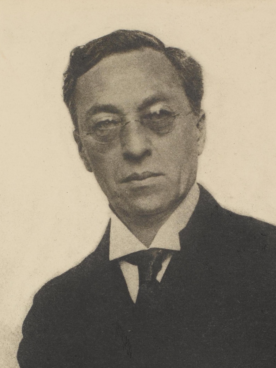
Wassily Kandinsky tried to answer that question. In Concerning the Spiritual in Art (Über das Geistige in der Kunst, 1911) he described colors as forces with direction, weight and temperament. Much of it reads as mysticism today, but underneath sits a working model that proves practical when choosing a palette.
Kandinsky's claims are psychological and personal, not optical. He says so himself in a footnote about the movement of yellow and blue: "These statements have no scientific basis, but are founded purely on spiritual experience." He is best read as a designer's notebook: strong opinions worth testing.
Two contrasts, not one wheel
Kandinsky starts by splitting color along two axes. The first is warm against cold, which for him means a leaning toward yellow or toward blue. The second is light against dark, which means a leaning toward white or toward black. Every color sits somewhere on both, giving four basic characters: warm and light, warm and dark, cold and light, cold and dark.
He calls these the first and second antitheses, and he treats them as independent. A color wheel hides lightness; Kandinsky gives it equal billing. That is how a designer should think, because lightness decides legibility and hierarchy while temperature decides mood.
In practice, that means asking two separate questions about any pair of colors. Do they differ in temperature? Do they differ in lightness? If the answer to the second is no, they can sit side by side as fields of color, but one can never carry text on top of the other.
Colors that move
The core of the system is movement. Kandinsky describes warm colors as approaching the viewer and cold colors as retreating. He also gives yellow and blue a second motion: yellow spreads outward from its center, while blue pulls inward. In Sadler's translation: "The blue, on the other hand, moves in upon itself, like a snail retreating into its shell, and draws away from the spectator."
He adds that the effect grows with lightness for yellow and with darkness for blue. That is why, for him, there is no such thing as a dark yellow. Darken it and it stops being yellow.
From this he builds his characters. Yellow is the typically earthly color: insistent, even aggressive, unable to hold deep meaning. Blue is the typically heavenly color, and its final feeling is one of rest. The deeper the blue, the stronger its pull.
Green: the two movements cancel
Mix yellow and blue and the opposing movements stop each other. Green, in his words, is the most restful color there is. He is not entirely kind about it. Restful turns wearisome after a while, and he calls green the self-satisfied middle class of the color hierarchy. A footnote gives the gentler version: anyone traveling from earthly yellow to heavenly blue has to pass through green.
For interface work this matches what we already sense: bright warm colors pull attention forward, deep cool colors recede, mid greens feel settled. Kandinsky gives the intuition a vocabulary.
Silence: white, black, and the glow of red
The second antithesis, white against black, is where his writing is most vivid. Both are silences, but different ones. White is like a pause in music that will be followed by more music: "It is not a dead silence, but one pregnant with possibilities." Black is the final pause, a silence with no future, something burnt out.
Then comes an observation that every UI designer has run into. Black, he says, is a neutral ground against which the smallest shades of other colors stand clearly forward, while against white many colors fall into discord or go mute. His examples are concrete: vermilion looks dull and muddy against white and clear and strong against black, and light yellow is weak on white but pure and brilliant on black.
Gray is the mixture of the two silences, and it has none of green's latent energy. It is simply motionless.
Red is his counterweight to all this calm. Unlike yellow, it does not spread outward aimlessly. It glows within itself, with a determined, inward intensity. Red also has the widest range of any color between warm and cold. Warm light red feels like strength and triumph; vermilion is sharp, like glowing steel; cool madder red deepens into something brooding. He warns that adding black quenches its glow. Red and green, the third antithesis, are complementary: the active and the passive held in balance.
Color as sound
His color-music analogies are among the most quoted parts of the book, and they often get flattened in retelling. Here is what the text says.
- Yellow. A keen lemon yellow hurts the eye over time, the way a prolonged, shrill trumpet note hurts the ear.
- Blue depends on depth. Light blue is a flute, darker blue a cello, darker still a thunderous double bass, and the deepest blue an organ.
- Green is the calm middle notes of a violin.
- Light warm red is the sound of trumpets, strong and harsh; vermilion can ring like a great trumpet or thunder like a drum.
- Orange is the note of the angelus bell or an old violin, and violet is an English horn or a bassoon.
He also hedges these himself: any parallel between color and music can only be relative. The analogies are most useful as a way to talk about register. A trumpet is loud and cuts through; an organ fills the room from below. That is a reasonable way to decide which color in a palette should be the alert and which should be the floor.
Shape, angle, and inner need
Kandinsky also linked color to form. In Concerning the Spiritual in Art he notes that a yellow triangle and a blue circle carry different meanings from a yellow circle and a blue triangle, and that sharp colors suit sharp forms while soft, deep colors suit round ones. He immediately adds that a mismatched pairing is not necessarily wrong and may open up new kinds of harmony.
At the Bauhaus he tested the idea. In 1923 the wall-painting workshop circulated a questionnaire asking people to fill a triangle, a square and a circle with yellow, red and blue. The answer he wanted, and largely got, was the yellow triangle, the red square and the blue circle. The sample, though, was Bauhaus students and staff who already knew his teaching. In Point and Line to Plane (1926) he carried the logic into lines and angles, pairing the acute angle with yellow, the right angle with red and the obtuse angle with blue, and reading the horizontal line as cold and the vertical as warm.
Behind all of this sits his central principle, which Sadler translates as the inner need (innere Notwendigkeit, often rendered elsewhere as inner necessity). A color choice is right when it serves what the work has to express, not when it follows a rule. This is the most durable part of the theory. The movements and sounds are a vocabulary. The inner need is the instruction to use that vocabulary on purpose.
Sources
- Wassily Kandinsky, Concerning the Spiritual in Art (Über das Geistige in der Kunst, 1911), translated by Michael T. H. Sadler (1914, first published in English as The Art of Spiritual Harmony). Public domain. Project Gutenberg eBook #5321. All quotations in this article come from this translation.
- Wassily Kandinsky, Point and Line to Plane (Punkt und Linie zu Fläche, Bauhaus Book 9, 1926).
- Wassily Kandinsky, questionnaire of the Bauhaus wall-painting workshop, 1923 (yellow, red and blue matched to triangle, square and circle).
- Sanzo Wada, A Dictionary of Color Combinations, browsable on espectro.dev at /sanzo-wada.